A Better Approach
to Website Design

Responsive Design. Strategic Development.
Simplified Content Management.

A Better Approach to Website Design

Responsive Design. Strategic Development.
Simplified Management.

Inspired To Do Better

There are a variety of agencies and specialists and a growing number of do-it-yourself website builders (Squarespace, Wix, Weebly, etc.) competing for your business. Selecting the best option for you and your business is important but it’s not easy.

I know this because I spent seven years supporting and managing digital marketing campaigns and projects, many of which required working closely with website designers, developers, and agencies of all sizes. These experiences are what motivates me to provide a better service to my clients.

Today, I help businesses and organizations navigate the website design and development process. I specialize in designing and building websites for organizations in need of significant upgrades or those seeking cost-effective alternatives to the bespoke, full-service solutions often pushed by larger agencies. I prioritize cost-effective solutions and minimize custom development wherever possible, and, where appropriate, leverage more affordable, well-documented content management systems, like Wordpress and Webflow. I place a strong emphasis on transparency to ensure my clients are well-informed about the advantages and disadvantages of their choices.

I am a University of Texas alum and currently live in Durango, CO with my wife, Katie, and our two dogs, Oscar and Tanner.

The Process

Because each project is unique, we work through to a series of important planning tasks and exercises to ensure we're creating the right solution for you. And, because a commitment to complete transparency is at the core of everything we do, you’ll know what it is we’re working on and why.

Image

Research & Discovery

Every project is unique and before beginning any design work we'll review and document your business objectives, evaluate your competitors, including what they do well and where opportunities might exist, identify key stakeholders and target audiences, and more.
Image

Design & Development

Adhering to your branding guidelines and design preferences, as well as other considerations we identify during research and discovery, we'll create wireframes and page mockups for review and feedback, eventually converting static designs to a live, fully functional staging website.
Quality Assurance Testing Icon, Waterman Web Design & Digital Strategy

Testing & Training

We'll spend as much time as needed testing your website in its staging environment to ensure that it's working as expected and looks great on computers, laptops, tablets and phones. We'll also provide one-on-one training so that you confidently make edits and updates to your site with on your own.
Launch Icon, Waterman Web Design & Digital Strategy

Launch & Support

With testing completed, we'll move your site from staging to production, making it accessible to anyone with Internet access. While your site will be completely accessible to you and your team to manage and maintain, we offer different packages for clients who prefer to have someone else handle ongoing maintenance and content management-related needs.

    Bexa Equity Alliance

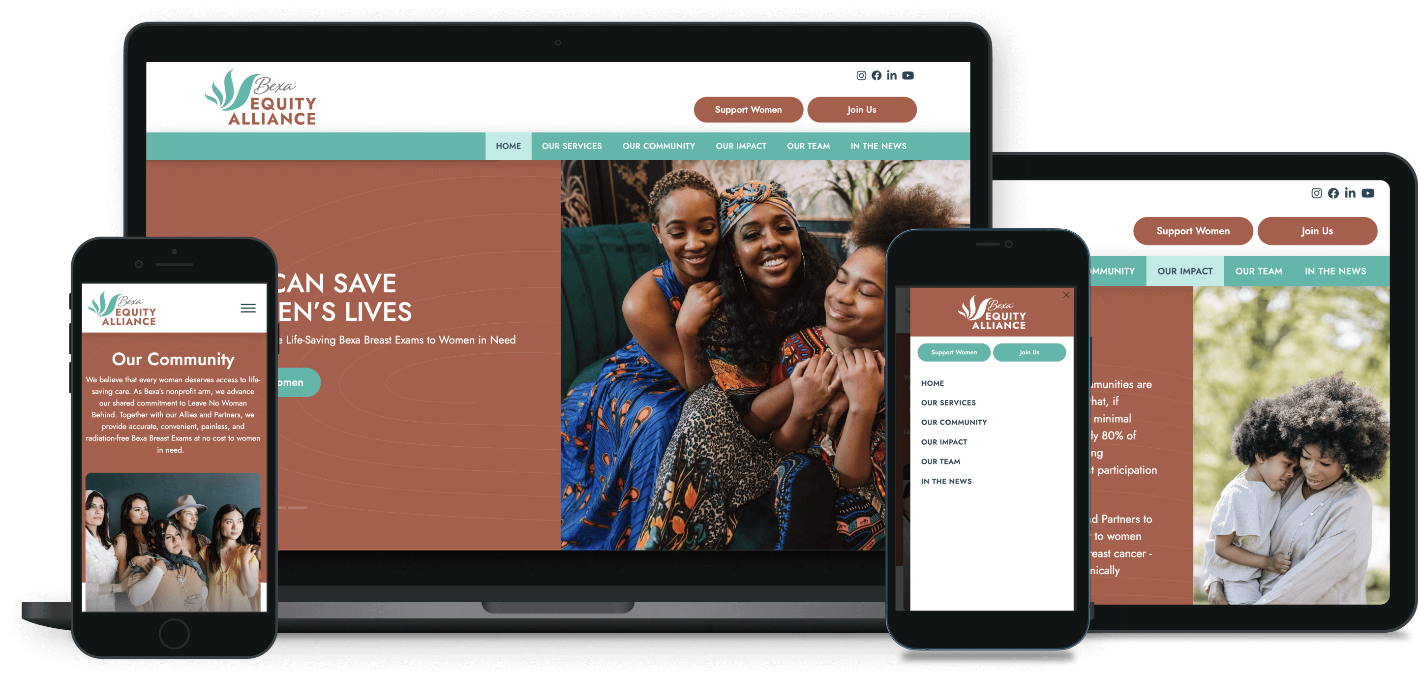
    It was an honor to design and build a website for the Bexa Equity Alliance (BEA), a nonprofit organization dedicated to providing accurate, convenient, painless, and tradition-free Bexa Breast Exams at no cost to women in need.

    Launched on November 1, 2023, the BEA website spotlights the life-saving work the team at the BEA leads, while showcasing the incredibly talented and dedicated team leading these efforts. It also highlights the many ways individuals, potential sponsors, and prospective community organizations can get involved and help women who are most at-risk.

    Behind the scenes, the website has been configured to simplify ongoing content management needs, like adding or removing events, showcasing new sponsors, and publishing new blog posts. We’re also leveraging MailChimp’s API to connect the website’s newsletter signup form with the BEA’s MailChimp account, removing the need to manually migrate entries from one site to another.

    Learn more about how the BEA is revolutionizing the way that women across the world experience care at bexaequityalliance.org.

    Gallery Image

    MCH Transportation Co.

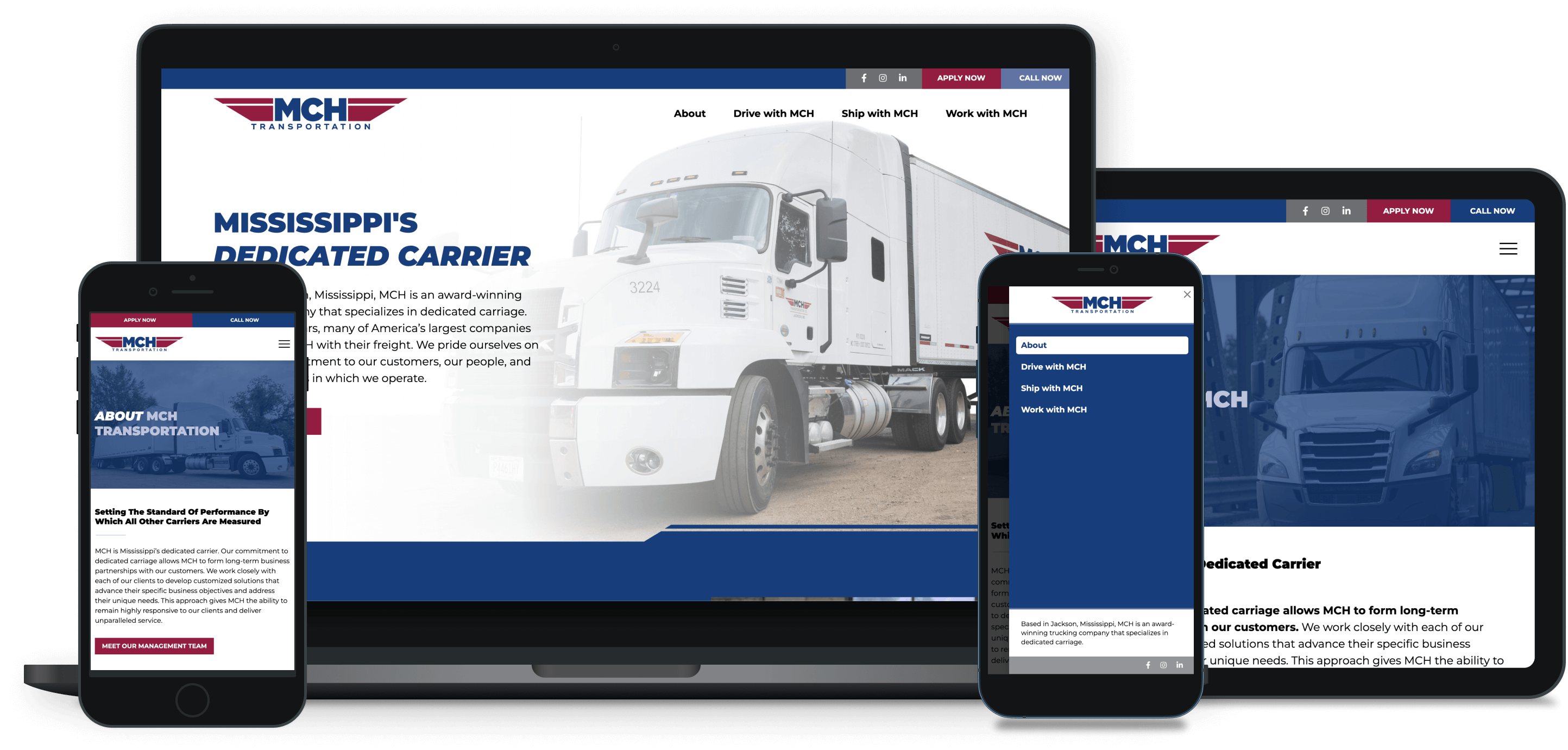
    The good folks at MCH Transportation have been leaders in the dedicated carriage space for nearly 40 years, but, like many businesses I’ve had a chance to work with, their website was increasingly dated and no longer reflecting the award-winning services they provide.

    Beyond just creating a website that looks great and is easy to use on phones, tablets, and computers, our primary objectives for the new website were to highlight MCH’s family-oriented culture, showcase its employees (staff and drivers), and appeal to potential drivers. To accomplish this, we really leaned into MCH’s sharp, bold branding and invested in new, professional photographs of the team, including drivers and MCH trucks and trailers. We also collected stories and testimonials from staff and drivers, which are now prominently featured throughout the website.

    You can learn more about MCH Transportation and see the company’s new website at mchtransport.com.

    Gallery Image

    The Heyday Group

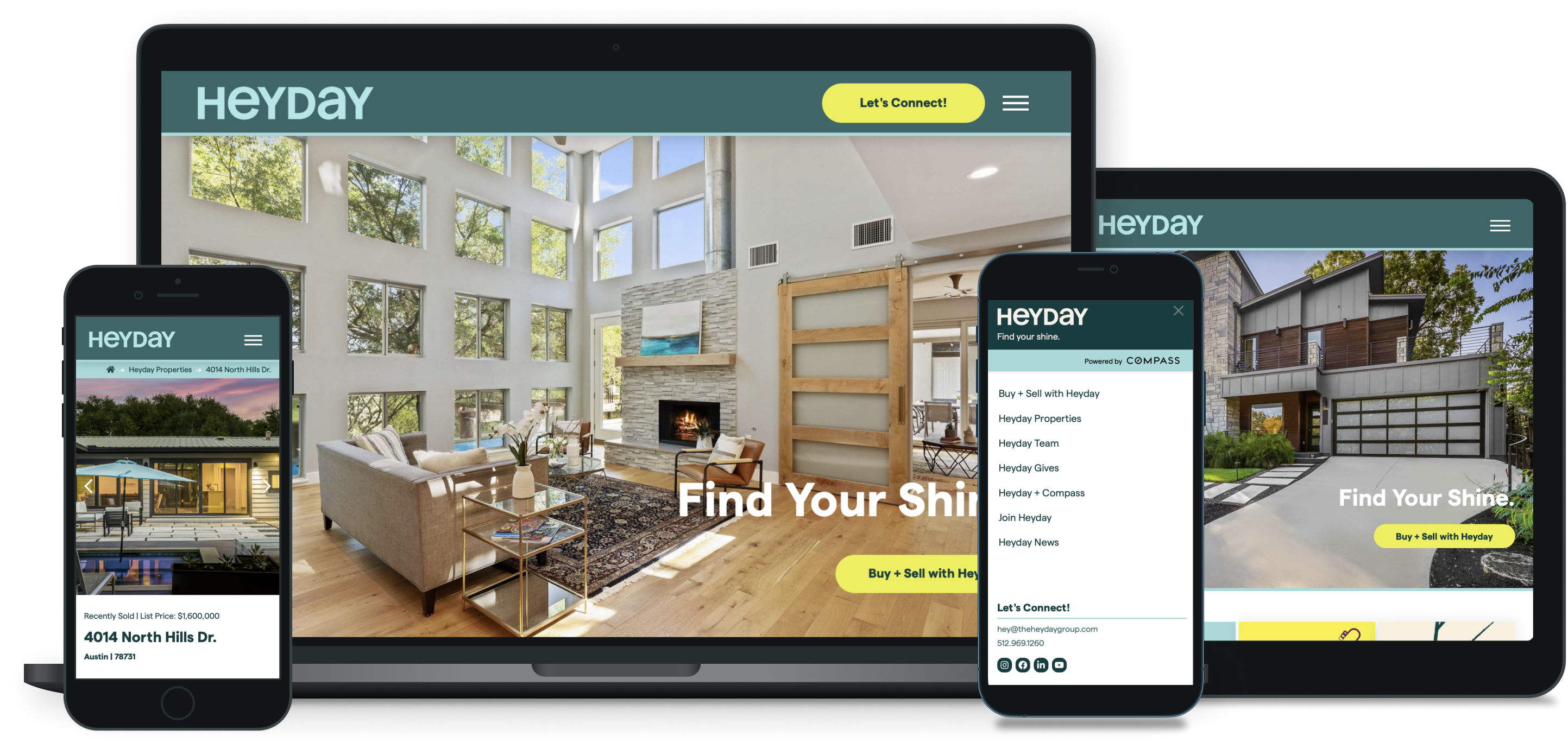
    I had the privilege of working with the good folks at Heyday, an award-winning residential real estate team with over 40 years of residential real estate experience, to design and build their website.

    Launched in January 2022 and recently updated to spotlight their expansion into the Colorado, the website features a combination of static, like the Buy + Sell page, and dynamic content, like the properties page, which uses a combination of easily assignable categories (i.e. featured property, for sale, recently sold, etc.) to automatically display properties where needed. Importantly, all of this is also set up in a way that lets the Heyday team tackle content updates, like adding new team members or showcasing new properties, in-house.

    Gallery Image

    Austin Sunshine Camps

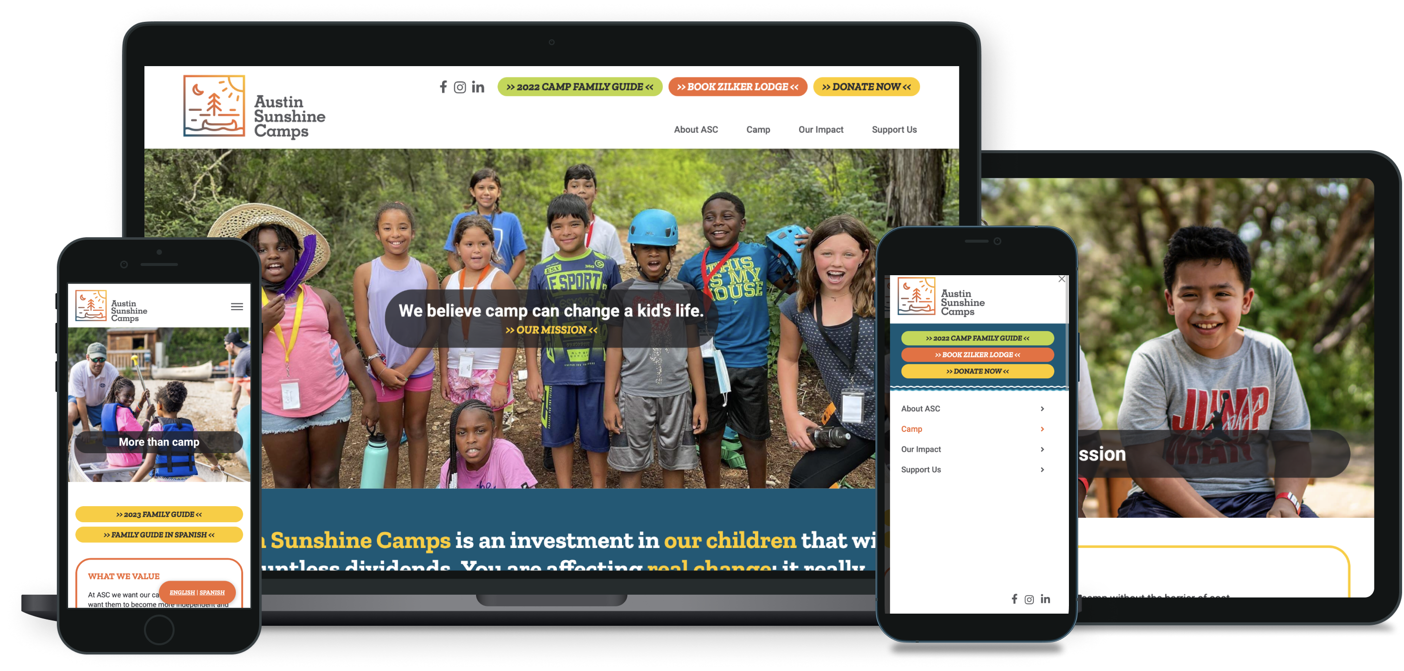
    Working in collaboration with Too Good Strategy, which provided wireframes and design mockups, I was hired to build a new website for Austin Sunshine Camps (ASC), whose mission is to provide the magic of overnight camp without the barrier of cost.

    The new website has been designed to make it easy for parents to find timely information about ASC’s camps. It’s also setup to make it easy for the ASC team to post or remove seasonal and full-time positions as they become available and are filled.

    Gallery Image

    Kendra Scott Women's Entrepreneurial Institute

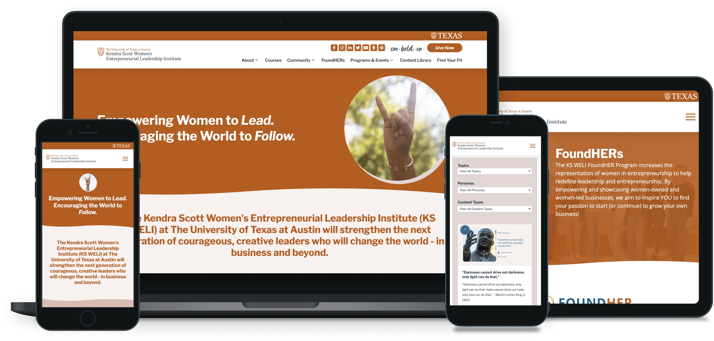
    Working in collaboration with Too Good Strategy, which provided wireframes and design mockups, I was hired to rebuild the website for the Kendra Scott Women’s Entrepreneurial Institute (KSWELI) at The University of Texas at Austin.

    In addition to giving the site a new look and introducing new features and functionality, like a dynamic resource library, one of the top priorities was to ensure that this new website was built in a way that would enable staff and interns at the KSWELI to play a larger role in ongoing content management needs.

    To do this, we created reusable components, like headlines and buttons, created reusable layouts and templates, and configured Advanced Custom Fields to display content dynamically.

    You can check out the new KSWELI website at kswelinstitute.utexas.edu.

    Gallery Image

    Wedge

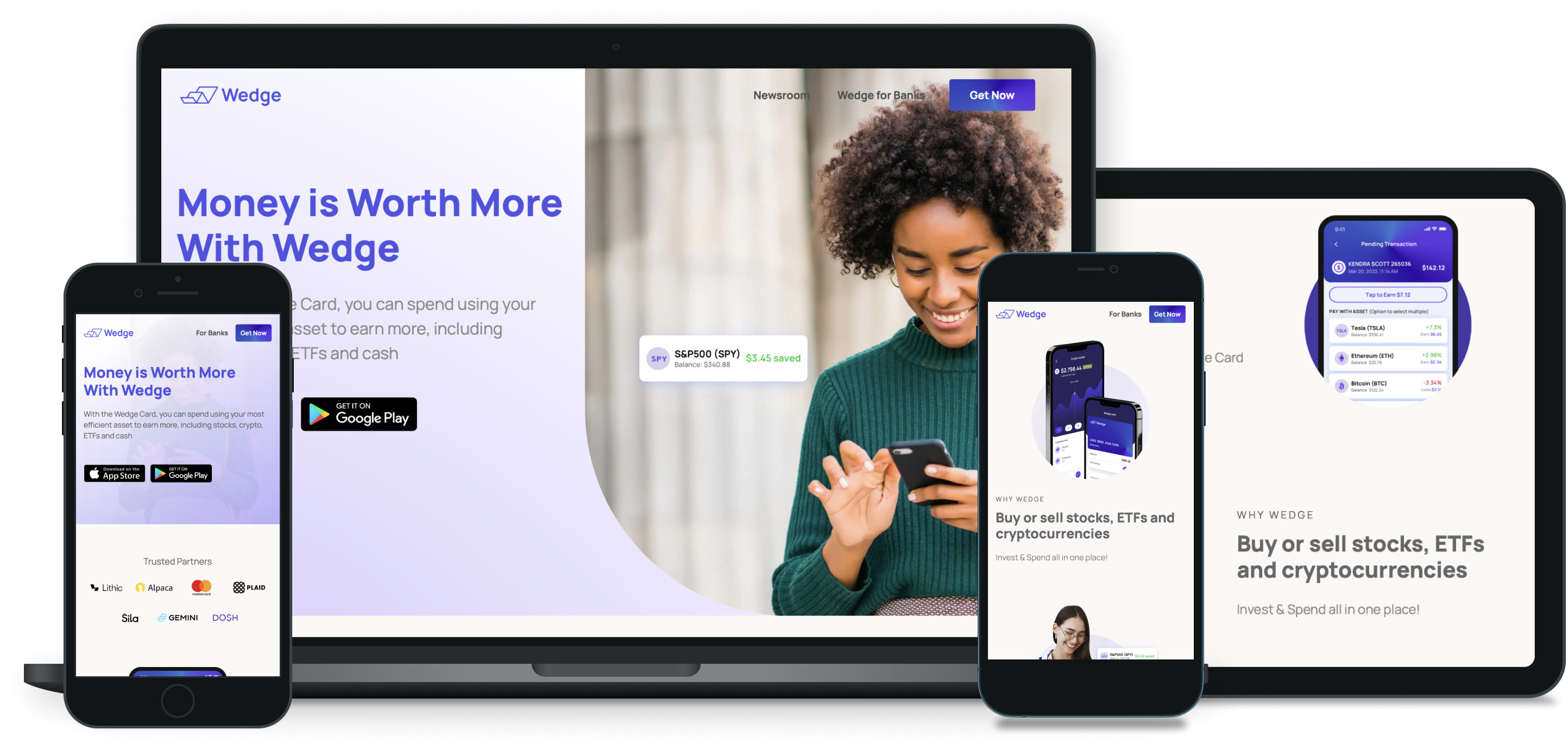
    Working alongside the talented team at Wedge Financial, Inc., we were tasked with building a website that showcases the company’s innovative technology and unique brand. The website was launched in November of 2021 and recently updated to spotlight a new offering called the Wedge Card.

    Like all of the projects we lead, the website has been built to enable the team at Wedge to handle ongoing content needs and updates.

    Gallery Image

    Capitol Pain Institute

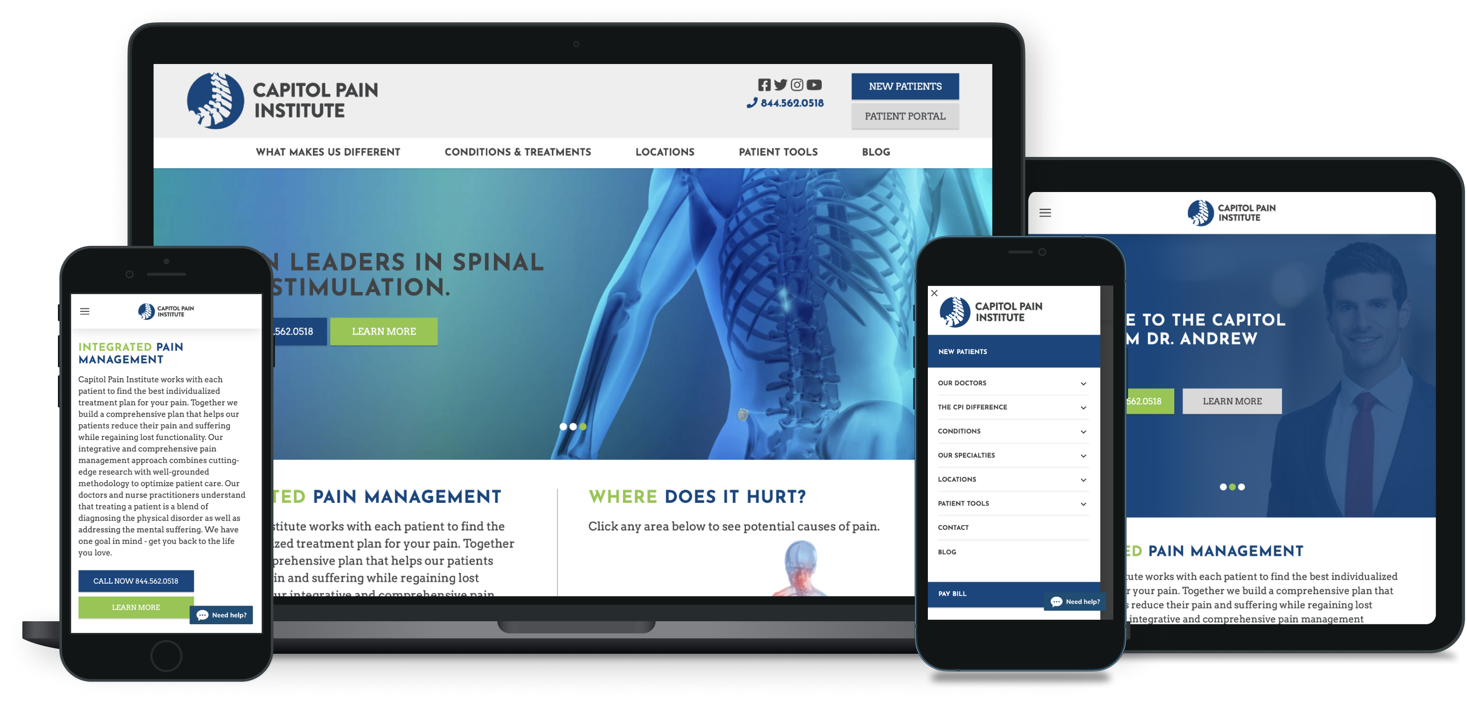
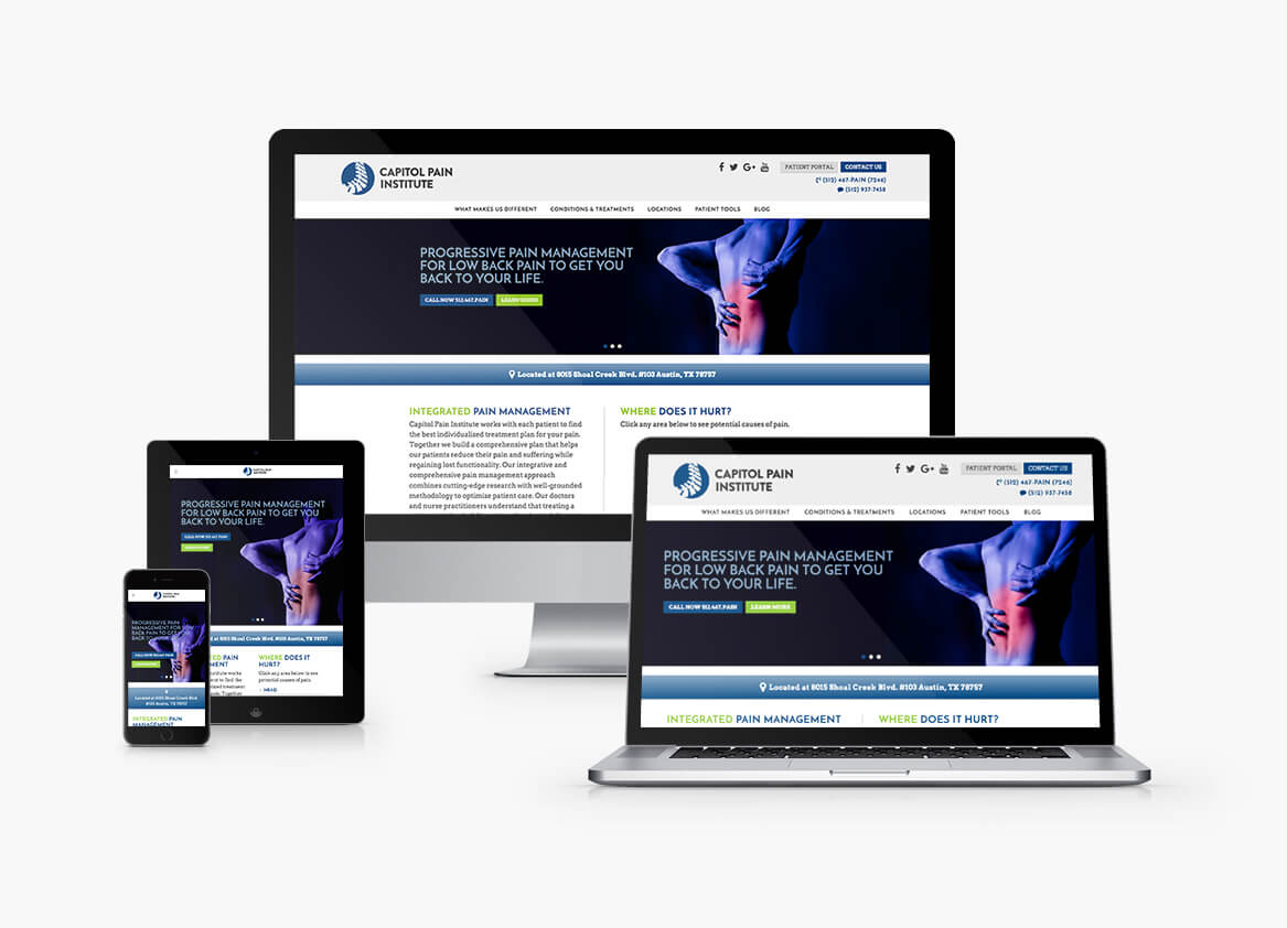
    Working in collaboration with Too Good Strategy, which provided, wireframes, and design and branding guidelines, we were hired to build the Capitol Pain Institute’s website.

    The website provides detailed information about Capitol Pain’s physicians and the specialized treatments they offer for a wide variety of conditions and is setup to enable Capitol Pain staff to easily publish new blog posts and make ongoing content updates and edits without writing a single line of code.

    Recently, leveraging Google Maps API services, we configured FacetWP and Advanced Custom Fields to allow users to use location-based search in order to find both locations and physicians in their area.

    Check it out at capitolpain.com.

    Gallery Image

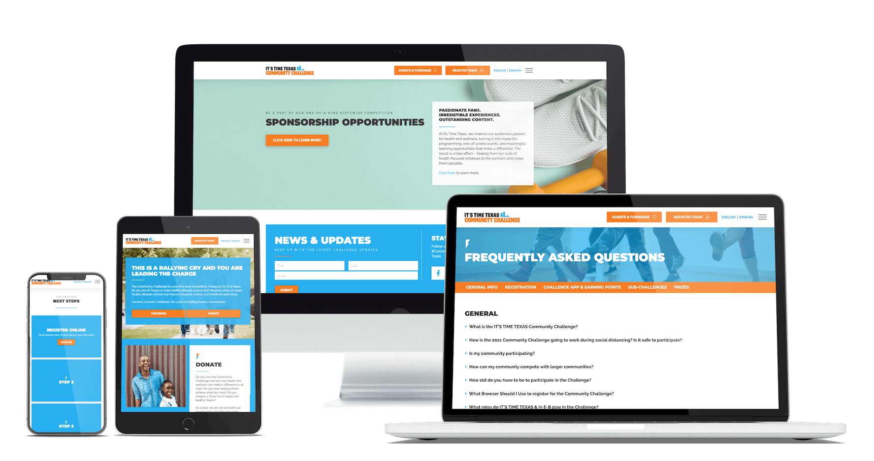
    It's Time Texas

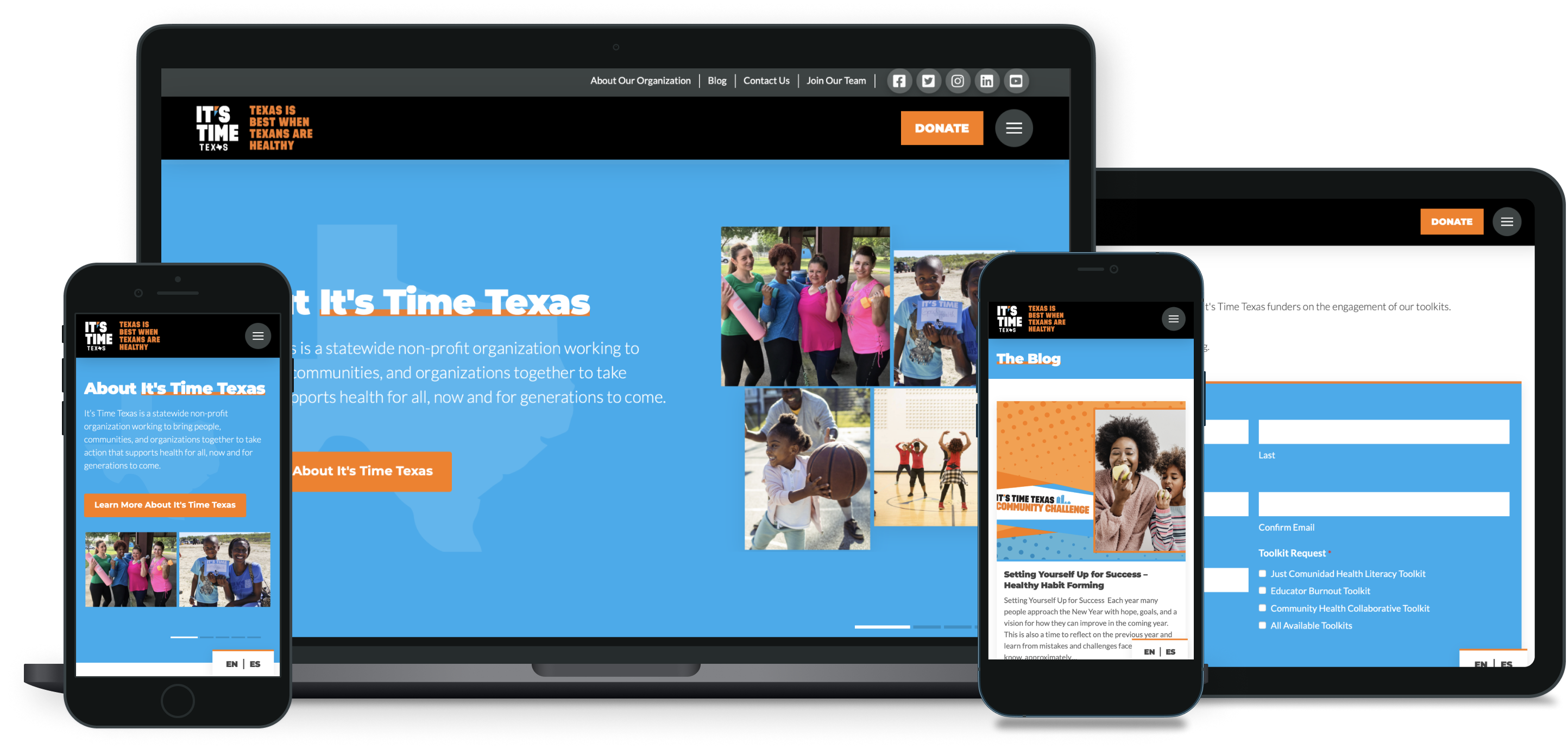
    I had the pleasure of rebuilding the website for It’s Time Texas, a Texas-based non-profit organization working to bring people, communities, and organizations together to take action that supports health for all, now and for generations to come.

    The updated website better spotlights timely events, programs, and initiatives, features a redesigned blog, and is now available in English and Spanish. It’s also now leveraging software updates and improvements that make updating copy-heavy pages, the About page, for example much easier to manage.

    Gallery Image

    Contact Info